City Cycles
How might we get more customers to book their bike rentals on the City Cycles website?

Overview
The project
I worked on a comprehensive UX redesign project for City Cycles, which encompassed redesigning their website and developing a new online reservation system.
my role
My role within the scope of the project included:
-
Conducting user experience research and analyzing data
-
Creating information architecture
-
Ideating possible solutions
-
Prototyping various solutions
-
Conducting usability testing to ensure optimal user interaction and satisfaction
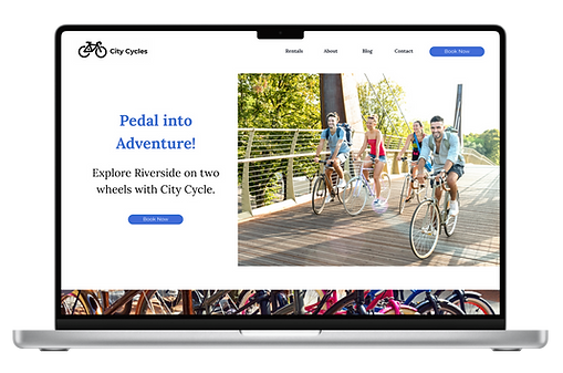
Video of current City Cycles website - Desktop version
The problem
City Cycles wants to increase the number of users booking bicycle reservations through their existing website. Users currently prefer to book via phone or in-person.
The current reservation process online requires a user to click on button towards the bottom of the homepage, then a link on the next page, then another link at the bottom of the third page. This final click then navigates a user towards an external page that does not work.
Messaging is unclear through this process as well, prompting users to "Online Call Ahead" and "click here" for reservation, creating confusion.
"How might we get more customers to book their bike rentals on the City Cycles website?"
design process
tools
Skills
Timeline
-
Figma
-
Google Meet
-
Google Slides
-
Google Analytics
-
User Research & Data Analysis
-
User-Centric Design
-
Wireframing
-
Prototyping - Paper and Digital
-
Usability & Universal Design
-
Usability Testing
-
Presenting Data
January 3rd -
February 5th, 2024
Research
Hypothesis: We have the belief that adding an easy-to-use online booking system on the City Cycle website that allows a reservation to be confirmed will decrease the frustration of our users when trying to rent bikes.
We believe the number of customers that complete an online reservation will increase and the number of phone calls will decrease because users will feel satisfied with the online booking experience.
User Research
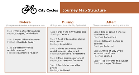
To tackle the challenges faced by City Cycles and achieve our goal of enhancing the online booking experience, I adopted a comprehensive research-driven approach. I collected analytics and conducted user interviews, journey mapping and a SWOT analysis to gather both qualitative and quantitative data. Through these methods, we gained insights into user behaviors, pain points, and preferences.
The analysis of the research data yielded crucial insights that shaped my design decisions for City Cycles' online booking system:
-
The decreasing trend of monthly online rentals underscored the urgency of the project, indicating a clear need for improvement in the existing reservation process.
-
Customers associated negative sentiments such as "Annoying" and "Frustrating" with the current system highlighted the extent of user dissatisfaction.


SWOT Analysis (L) to understand City Cycles strengths and areas for improvement, as well as a Journey Map (R) to help understand a user's experience through the online booking process
User Persona
Based on the research findings, I created a detailed user persona to represent the City Cycles' target audience. This persona helped me empathize with the users' needs and preferences throughout the design process.

City Cycles User Persona
Ideation
Throughout this UX project, my design process was comprehensive and iterative, focusing on understanding user behavior and needs while striving for effective problem-solving and user-centered design solutions.
This process included:
-
Utilizing "Now How Wow" and Matrix Method ideation approaches
-
Mapping out the site structure
-
Developing a user flow
-
Sketching a paper wireframe
-
Utilizing Figma to build wireframes
Ideation Methods
With my hypothesis in mind and user research conducted, I embarked on ideation sessions using methods like the "Now How Wow" approach and matrix method mashups. These sessions allowed me to generate a variety of potential solutions.


Now How Wow (L) & Matrix Mashup (R) ideation approaches

Site Map
To enhance the organization of content and streamline navigation for City Cycles, I analyzed the existing site map, identifying areas for improvement and restructuring to ensure a more intuitive user experience. Through thoughtful consideration and strategic planning, I developed a new site map that effectively prioritized content hierarchy and facilitated seamless navigation.
City Cycles Revised Site Map
User Flow
To gain insight into the step-by-step process a user would undergo when navigating the City Cycles website and reservation process, I created a user flow, which allowed me to identify pain points and opportunities for improvement within a user's journey.

City Cycles User Flow - how a user could navigate the online booking experience
wireframes
Developing both paper and digital wireframes facilitated the visualization and refinement of key features, elements, and functionalities for the City Cycle website, with a focus on its online reservation process. These wireframes were instrumental in aligning our design decisions with the needs and preferences of users.
By incorporating insights gathered through user research, persona creation, and ideation, we ensured that the wireframes served as a solid foundation for addressing the identified problem statement. This user-centered approach allowed us to prioritize usability and enhance the overall user experience of the City Cycle website and its reservation system.


City Cycles Paper Wireframes, showcasing drawings of the homepage and a 2-step online reservation process to visualize how best to organize important and required information and features on the website

City Cycles Digital Wireframe, designed in Figma, showcasing homepage and a 2-step online reservation process
prototyping

Design Comp
My design choices prioritized simplicity, intuitive navigation, and visual appeal, with a focus on streamlining the online reservation process, ensuring that key information about bike rentals and the shop information was easily accessible, and that the booking interface was clear and user-friendly. I was provided the colors, typography and components by City Cycles UI kit to use within the design.
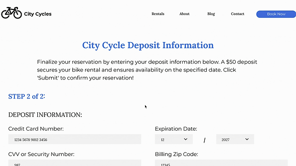
City Cycles Design Comp, showcasing the homepage, the 2-step online reservation process (including what those pages would look like with user data), and a Confirmation page
paper & digital prototypes
I created paper prototypes to test possible design concepts that were ideated earlier in the project. Then I transitioned to building the first version of a digital prototype with interactive features, allowing for a more realistic simulation of user interactions and providing valuable insights into the usability of the redesigned pages on the City Cycles’ site.
I also utilized the “Calendar Interactive UI Kit,” designed by Faiz Abiyandani, to add an interactive calendar feature to the online reservation process.
Video of City Cycles V1 Prototype, showcasing the interactive Calendar feature
Following the development of my initial V1 prototype, I aimed to address a concern identified during my initial user research phase: the frustration users experienced when completing a form only to have their input deleted upon navigating away from the page.
To mitigate this issue, I devised a solution by creating individual frames within the prototype to display a pop-up dialogue whenever a user attempted to navigate away from the reservation form after inputting information. This prompt presented users with the option to confirm their intention to leave the page, ensuring that no data was inadvertently lost and allowing users to make an informed decision about their next action.

City Cycle V2 Prototype, showcasing the pop-up prompt when user tries to leave page once data has been entered on the form
User Testing
Process
Adhering to usability testing best practices, I organized a comprehensive usability testing process for my prototype, ensuring feedback collection and informed iteration. This process included:
-
Implementing remote usability testing via Google Meet for user convenience and accessibility.
-
Conducting structured interviews with users as they interacted with the prototype in Figma, enabling real-time feedback gathering.
-
Systematically collecting data during testing to capture observations, user comments, and performance metrics.
-
Utilizing collected data to inform iterative improvements for the next prototype iteration, prioritizing usability enhancements based on user feedback.
Feedback Cycle
I started by analyzing user feedback obtained from usability testing sessions, with the goal of finding and addressing any challenges to better improve the user experience for our new solutions. During this analysis, the top pain point identified was that users dislike it when the information they have entered into a form disappears or is deleted when they attempt to navigate to a link within the form (e.g., the “Terms and Conditions” page).
To address this issue, I prioritized this feedback by proposing a solution: ensure that any clickable links within the reservation process navigate to a separate tab, external from the reservation page, or create a pop-up within the page with the waiver/liability information.
Iteration
To address users' concerns about losing their data while viewing the liability statement, which came up in usability testing, I introduced a user-friendly pop-up feature that displayed the waiver without disrupting the reservation flow. This ensured users could access essential information without navigating away from the reservation form, maintaining a smooth and uninterrupted booking experience.
Upon implementing the solution derived from user feedback, testing affirmed that the additional solution functioned as expected. With the concept validated successfully, I determined that the prototype was prepared for launch!
Final Prototype
Video of City Cycles digital prototype in action - LINK TO FIGMA FILE
Results
solutions
Below are the overall solutions I designed and implemented to address the problem statement identified in the City Cycles UX project:
-
Added three separate CTA buttons (“Book Now”) on the homepage to help users easily find where to complete an online reservation
-
Created a simple and seamless 2-step reservation process to help users
-
Developed a form that gives the information City Cycles need to reserve the bike for a user
-
Added pagination UI pattern to let the user know exactly how many pages it takes to make a reservation
-
Created a pop-up on the last page for users that want to read the “Waiver/Liability” statement, so their data is not impacted when they return to the form
-
Added a Confirmation page after submitting form to give the user peace of mind that their reservation submission was successful
In addition to these solutions, I would propose the following next steps to City Cycles for consideration, as these were suggested by users during research and/or testing, however outside of the current scope:
-
Add images of bike options so that users can see what is available to them for rent
-
When revising future website pages (ie. Blog, Rental or About pages), ensure that information is categorized in a way that is intuitive and grouped by related topics/information
Lessons Learned
During the design process, one notable challenge I encountered was the time-consuming nature of creating the “popup” interactions within the digital prototype. Rather than being deterred by this obstacle, I saw it as an opportunity for growth. I proactively sought out additional educational resources to deepen my understanding of advanced Figma practices, specifically focusing on overlay interactions to mimic popups. This experience reinforced the importance of continuous learning and adaptability in the ever-evolving field of UX design, reminding me to embrace challenges as opportunities for personal and professional development.
Another valuable lesson I encountered during the project stemmed from the temptation to expand the scope to address a user issue outside of the initial problem statement. Although it presented an opportunity to further develop my technical skills within Figma, I learned firsthand the importance of maintaining focus on the defined project objectives.
While integrating the out-of-scope solution into the prototype required additional time and energy, it also served as a reminder to prioritize project goals and adhere to established timelines to avoid deviation and ensure project efficiency. This experience underscored the significance of maintaining discipline in scope management and staying aligned with project objectives to achieve successful outcomes.
View More Projects:


UI/UX Designer
© 2024 Sebrinia Welch


